Showing posts with label acrylic paint. Show all posts

Tuesday, January 24, 2023

Scribble Paintings

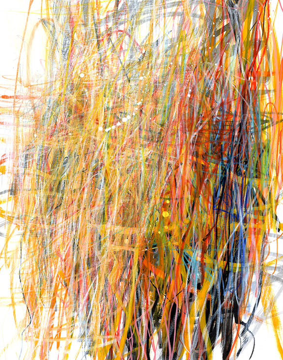
 I've been scribbling a lot lately, layering marks in various materials. You can see previous posts about this work here and here.  Like many techniques, scribbling is easy. Making an interesting image with it takes some effort, careful judgement, lots of micro-decisions, and practice. Her is a video showing one way that a particular scribble painting developed. Processes vary quite a lot between individual works, but there is some consistency among those that I do in one "sitting". A sitting doesn't mean all at once, start to finish, but that I work on the group continually until they are done. I don't leave them for weeks while I work on something else. So there is a continuity of thought process.

Here are some of the pieces in this series. They are all 11"x14" on Bristol.


 Thank you for visiting my blog! Please do comment. I check every day and post them, the ones that are real comments and not spam. THANK YOU.

Thursday, June 9, 2022

Jane's Art Basics - beginner's color mixing

Mixing colors is fun, meditative, and it can be very satisfying. Many color mixing instructions have you making systematic color charts, with small swatches of each color. They look great, they make you feel like you've accomplished something, and they are useful for reference. 

Shades (dark) and tints (light) of Permanent Green Light

Another way to get to know your colors is to choose one color, and mix it with white and colors that are adjacent to it on the color wheel, or "analogous colors". Also mix it with different versions of the same color. In the following video I start with turquoise out of the tube. I mix it with another turquoise (deeper, darker Pthalo Turquoise), as well as white, green, and a couple of yellows. Try this with any color.

You can try out color combinations in your sketchbook in a non-systematic way. Here is a video in which I put together colors in a kind of 'mood board'.


If you are just beginning a painting practice, I recommend getting as many paints as you can afford. Start with at least a few high quality paints, such as Golden, and supplement with more budget-friendly paints. Include, if possible, two different versions of each primary color: red, blue, yellow. Here is a little article on Color and Paint, which you can download for reference. It includes color recommendations.

Wednesday, March 16, 2022

Jane's Art Basics: Acrylic Paint Quality

Use the Paints That Work for You

If you are a beginner, you may well get conflicting advice on what kind of paint to buy. Many feel that starting with the highest quality paints you can afford is necessary to have success as a beginner. If you are beginning with a teacher who requires specific, high quality, paints, then that makes sense. 

If you are starting without a teacher, your choice of paint will depend on what your goals are. Do you want to explore image-making as a way to express yourself, or just to relax and do something that takes you out of your everyday life activities? Or do you want to learn, step-by-step, how to make a certain type of painting? Is it a casual interest or a commitment to mastering something specific?

If you want to do art to relax, explore, discover what is in you as an image-maker.... my recommendation is to begin with fairly affordable paints so that you can freely experiment without worrying about 'wasting' expensive material. If high quality paint is going to intimidate you, leave it out. For now.

Once you are  comfortable with a few techniques, and you are committed to your practice, I HIGHLY recommend introducing professional quality paints, such as Golden Fluid Acrylics or Heavy Body Acrylics from Golden, Holbein, Sennelier, or other manufacturers. Start with just a couple of colors that you use a lot, or primary colors - blue, red, and yellow - that you can mix into other colors. Then add more as you grow into your commitment to painting. You will likely extend them with acrylic mediums, as they are very pigment-rich. A little goes a long way.

High Quality Professional Grade Paints

Golden Fluid Acrylics are super easy to use, and come in a huge range of colors. They are professional quality paints, with heavy pigment load, so you can extend/dilute them with any acrylic medium and still get vibrant colors. Other manufactures of high quality paint include Holbein, Sennelier, Kroma, Tri-Art, and many others.

Student Grade Paints

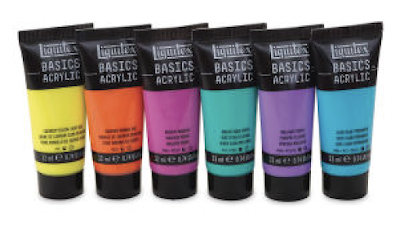
Liquitex Basics are one of several brands of student grade, affordable, paints, that may be a good choice for a beginner. They come in sets, and are very affordable.


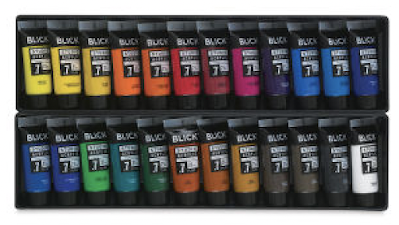
Blick Studio Acrylics are similar to Liquitex Basics. They are affordable, and come in a wide variety of colors.

Arteza offers a few lines of acrylic paints. The "premium" are a decent student-grade paint. There is not a lot of information on the packaging, so it's not clear how light-fast or permanent the colors are. Still, if you are just beginning, these aspects of paint may not be your highest priority. 


Ultimately, if you are committed to a painting practice, you will want to explore the range of qualities of paints. You will find the variety of paints that work for you. I hope this gives you some guidelines.

Sunday, February 27, 2022

Absorbent Ground with Resists

Here is a little experiment I did with Golden Absorbent Ground and various Golden mediums used as resists. 

I applied two coats of Golden Absorbent Ground to a sheet of Bristol, and, after the surface was completely dry I applied stripes of Clear Leveling Gel, Color Pouring Medium, High Flow Medium, and Super Matte Medium to see how they would work as resists under various types of paint: watercolor, fluid acrylic, High Flow acrylic, and Heavy Body Acrylic.


You can find information on all of these products on the Golden website, and purchase them at Blick or your favorite art supply retailer. Here are links to the Absorbent Ground; Clear Leveling Gel; High Flow Medium; Color Pouring Medium; and Super Matte Medium.

The vertical stripes are the mediums used as resists. The horizontal yellow stripes are the paints I applied over them. I hope you find this information helpful. Trying out new materials can be a way to get out of a rut or reinvigorate your art practice. Thanks for visiting!


Monday, February 7, 2022

Art Basics - Playing with Arylic Paints in a Sketchbook

In an attempt to reach out to beginner painters, I've been exploring student-grade paints. Some teachers highly recommend that the beginner start with the best of paints, such as Golden. And that probably is good advice for some. However, I have seen many people afraid to explore freely because of the cost of the material. It's easy to feel intimidated by high quality paint, as if your image must be worthy of such fine material. 


I feel it's important to get the paint that suits you and your budget. If an expensive set of high quality paints is going to sit on the shelf untouched because of fear, then get something more affordable. Student grade paints do not have the same pigment load as professional paints. That is a given. They also have different consistencies, brand to brand. The only way to really know what is right for you is to try a few different brands and qualities of paint.

My advice to beginner painters who are not ready to spring for high-quality paints is this: start with a set of student grade paints (not craft paints), and gradually add your professional quality paints (Golden being my preferred, Holbein, Sennelier are some I've used as well) as needed. One tube or bottle at a time. grow into your good paints as your art practice develops.

Supplies I am using in this video are:

Strathmore sketchbook, hardbound, spiral bound. You can see some commentary on sketchbook options in this video.

Blick Matte Acrylic White, Galeria Acrylic Paint, Liquitex Basics, Arteza premium acrylic paint

Disposable Palette

Palette Knife; I like this square-ended one, but I suggest you try a few different shapes. Mine is the small #7, Liquitex Freestyle Painting Knife.

Your eyes and your hands are your most important tools. Enjoy!!

Tuesday, April 20, 2021

Opacity with Marble Dust

 I was investigating what happens to acrylic paint when you add marble dust. I have used it cold wax and oil media, as well as printmaking inks, to stiffen the consistency of the material. So what happens if you work it into acrylic paint?


Looks like we've found a way to make transparent acrylics opaque without adding white, which changes their value. 

From right: quinacridone magenta, manganese blue hue, Indian yellow hue, and quinacridone gold, each in their straight-up form and with marble dust added.

This is what I got from Blick.

At the top, the magenta and blue are opacified quinacridone magenta and manganese blue hue
At top on the left you see Indian yellow hue straight out of the bottle; to the right you see it with marble dust added.


Friday, January 3, 2020

Building a Textured Ground with Transparent Paints

In this video I am working on a 30"x40" canvas. First I prep the canvas with Hard Molding Paste, let that dry completely, and then layer transparent acrylic colors, some diluted with water. Much of this rich, textured background will get covered in the process of developing the painting, but it provides a counterpoint to the flat colors and different kinds of textures I will layer over it.

The colors I am using include Sap Green Hue, Turquoise Pthalo, Sepia (high flow), Pthalo Blue, and Quinacridone Gold. This is not a formula; try various combinations of transparent/translucent colors.

I am using Fluid Acrylics as well as High Flow. My tools include an off-set spatula type of painting knife and a Catalyst Wedge. You could try different types of squeegees too.

Here is a close-up of the molding paste texture. I recommend you let this dry overnight before applying layers of paint.

This is the first layer of paint: sap green, turquoise, and sepia. I let this dry before adding more layers.

At this point I may let it dry and then apply the coat of matte medium.
 I will post pix of the finished piece or pieces. Try this on paper or panel at a smaller size too.

Thursday, December 7, 2017

White Paint

I tested six different brands of white paint to see how they compared in opacity.

My favorite brand is Blick Matte Acrylic, but it is not available in Canada. I did find that the Holbein, Sennelier, and Pebeo were pretty comparable. I will test the Liquitex a little further to see how it performs in my regular painting practice.

Wednesday, January 28, 2015

Acrylic Paint 101, Part 2 - Layering

OK, here is another video demo on the basics of acrlyic paints.
  • Let your paints dry between layers.  
  • Pay attention to transparency and opacity when layering.


 Here are a few pieces that rely heavily on layering transparent and opaque paints:

10"x10", acrylic, collage, and drawing media on panel

10"x10" acrylic, collage, and drawing media on panel

8"x8" acrylic, collage, and drawing media on panel

You will get plenty of practice with paint in my workshops.  Coming up next is:

Art and Soul in Portland, Oregon 

March 2 - 8
5 spaces left in Big Fat Art
4 spaces left in Working in Series
My other workshops are full, but you can get on a wait list.

In April I am teaching for the first time at Northeast Art Workshops in Gloucester, MA

Balancing Opposites: the Yin and Yang of Abstract Composition

April 15 - 17, three-day workshop

Friday, January 23, 2015

Acrylic Paint Basics and a GIVEAWAY

I get a lot of questions about the basic aspects of acrylic paint - fluids vs. heavy body, opacity and transparency, drying time, different brands, and more.  So I made a little video demonstrating some of the differences between fluid acrylics and heavy body acrylics, including some student-grad acrylics, which are sort of in-between.  I also demonstrate a couple of things about opacity.
Read all about Golden Fluid Acrylics here. Watch a video here.

See an informational video about Golden heavy body acrylics here.

Utrecht Artist Acrlyics, owned by Blick Art Materials now
Holbein Acrlyic


All of the above are available at Blick Art Materials and many other art stores.  See my Favorite Materials Page for other suppliers (link in right margin). 

OK, now here is the good part: I have a set of Golden Fluid Acrylics to GIVE AWAY.
This is the set I'm giving away: ten 1-oz bottles of Golden Fluid Acrylics
To qualify for entering in the giveaway (randomly chosen), please comment on this post and make sure you identify yourself uniquely (not just "mary", but "mary in Illinois".  I will post the winner on Monday, and the winner is responsible for contacting me with a mailing address.  This giveaway is not geographically limited.

Next up in this "series" (not sure if it is a series yet) is a video about layering and drying time.  Let me know if there are particular topics you would like me to cover in "Acrylic Paint 101".  Think Basics, not fancy techniques but stuff about the paint itself.

Good luck!

Wednesday, December 24, 2014

Black and White

I've been in awe of Mayako Nakamuro's black and white work for a couple of years now since discovering her on Flickr.  The rawness and energy of the mark making is breath taking.  See her work on Pinterest as well.

Using her as inspiration, I began a series of 12"x12" black and white pieces, using India ink, graphite, acrylic, and crayon:

1. I'm considering this and the two below provisionally finished.

2

3

A dozen or so pieces in various stages of the process
#2 above, in process

Another in process: a layer of marks, then a layer of paint

This is the first layer: India ink washes, graphite, pencil, and white Caran d'Ache crayon

Same materials as above, the first layer

This is the piece above, with a layer of paint.
I'm finding working in black and white very freeing.  It allows me to pay more attention to the quality of marks and the range of value.  When stuck in a rut, it can be extremely helpful to look at the work of another artist and use it as a springboard.  Some shy away from "copying" another artist, but I feel that even if you begin by copying, if you do enough pieces you inevitably make them your own.  For this group I really did have a couple of Nakamura's pieces up on my computer screen, and referred to them when I felt I was repeating my same old familiar marks.  But for the most part I feel I found a way to move forward with my own work.  THANK YOU Mayako Nakamura for the inspiration!!

Hope you all have a fabulous holiday!

Yesterday was my birthday, and I want to thank all of you who posted birthday on my FaceBook page.  It was, indeed, a very happy birthday!

Saturday, August 16, 2014

A Challenge for your Inner Critic - and a giveaway

I do this exercise as a warm-up in some of my longer workshops, and also in Art Therapy For Your Inner Critic.  It is fun, more challenging than you would think, and it engages your Inner Critic in a way that is actually helpful rather than discouraging. I use this approach in my Art of the Postcard class too, but it's a little different.

Here is how it goes:

Create a piece (or better yet, a series of pieces) in which each quadrant is distinctly different from the others.  Do not simply divide the substrate into four equal parts and make separate compositions.  It has to be one composition, but if you were to divide it in four, the pieces would NOT look like they were cut from the same piece.   Use paint, collage, drawing, stamping, or any other technique.

You can see two examples in the second half of this post.  And here are a few more:

Acrylic paint, watercolor crayon, graphite, collage on 10"x11" printmaking paper

Acrylic paint, Pitt pen, watercolor crayon, graphite on 10"x11" printmaking paper

Acrylic paint, graphite, watercolor crayon, collage on 10"x11" printmaking paper.  For links to my materials see "My Favorite Materials" in the right margin of this blog.

E-mail me your examples (scan or photograph, send jpgs) and I will post a selection.  Tell me what challenges you faced, if you made any discoveries, or if it was simply fun and easy.  I will choose a winner, who will receive a set of Blick Studio Acrylics.  These are good student-quality paints, much much better than craft paints, and much less expensive than professional quality paints. 

Have fun, and good luck!  I will post a winner on Friday, August 22, so don't hesitate.  Take out your art materials and get to work.

Friday, February 28, 2014

Paint Quality

Often I am asked why professional grade acrylic paints cost so much compared to craft paints or student grade paints.  I am asked a lot of questions about paint, and I will address this one here.  You can find loads of information about specific brands of paint on manufacturers' and retailers' web sites as well.
Golden, Blick Studio, and Liquitex Basics Paints
Americana Craft Paints

Pigment Load

Pigment is the expensive part of paint.  The higher the pigment load, or relative proportion of pigment to "binder" (acrylic polymer emulsion, in acrylic paints, plus, in cheaper paints, various fillers), the more expensive the paint will be on a per volume basis.

A paint with high pigment load, any professional quality paint, will produce more intense color, and can be extended (diluted) with medium (matte medium, glazing medium, etc) much further than a paint with low pigment load (craft paint).  In my Unlocking the Secrets of Color class I always suggest that you extend the darker colors (pthalo blue, especially) with medium; otherwise they look almost black because the pigment is so dense.  

In this video I am comparing professional quality paint (Golden, though I also use some Holbein paints and Sennelier, and you may find brands that you prefer) with craft paint (Americana), and then I try student- or economy-grade paints, in two different colors.  The student-grade paints are in two different brands:  Blick Studio Acrylic for the quinacridone magenta, and Liquitex Basics for the yellow.  So...  this is not very scientific.  I'm not intending to compare brands, just to compare color intensity with two different colors, over three different price-ranges of paint.  I suggest you conduct your own tests using this credit card scraping method.

Another test of pigment load is to mix your paint with titanium white and see how much white it takes to achieve a given "tint" of your color.  This is called "tinting strength":  the more white you have to add, the greater the pigment load and the better the tinting strength.  Your results are likely to vary a bit from color to color, and the different brands of paints will vary as well.

Transparency and opacity are a different issue, and we'll look at it in a later post. Hope this is helpful.

Wednesday, November 6, 2013

Book Giveaway!

I am excited to share with you a video I just made demonstrating a technique I learned from Patti Brady: creating acrylic "skins" to use as collage material.  I am using the technique to make transparent skins using a soft gel medium.  In her book, "Rethinking Acrylic",  Patti shows you various other ways of using the technique. 


I am offering a copy of Patti's book to a random blog reader who comments on this post.  All you have to do to have a shot at "Rethinking Acrylic" is comment on the blog.  Make sure you include your full name, or whatever moniker you'd like to use so that I can identify you in the draw.  I will post the name of the winner on Monday, November 11, and it will be your responsibility to contact me with your mailing address.  This is open to readers in the USA and Canada only, as overseas shipping is prohibitive.

Enjoy the video!

Here are the pieces still in process.  I will post them again when finished. 


This one is not in the video.

If you are going to try this, I encourage you to make several transparent skins at one time, and work on a series of collages.  Give yourself room to play!

My 2014 workshops all focus on working in series, so I am plugging that concept.  I've found it to be one of the most productive aspects of my art practice.

Click here to see the Tulip Slick paint I use for scribbling. 
Click here for the soft gel gloss, and other gels.
Click here for plastic sheet protectors.

Comment to have a chance to win "Rethinking Acrylic", by Patti Brady.

Tuesday, December 13, 2011

Paint-Collage-Line

Thanks for all your comments on my Gallery 47 show! I will post a how-to on the wood panels as soon as I get my next order from Dick Blick. Meanwhile, I wanted to show you some recent sketchbook output. I was looking at a few images of Kurt Nimmo, one of my favorites on Flickr. Inspired by the spareness of his work, I decided to play with the idea of paint-collage-line. Each piece has at least one paint application (and not much more), one piece of collage, and a linear element. These are made in the spirit of the JOY of creating!

I used a brayer to apply Baltic Green (Liquitex), then spritzed and blotted it, first letting the water drip down the page a bit. The collage is a bit of mono-print; and the line is a blind scribble.

More Baltic Green, plus quinacridone gold (Golden Fluid Acrylics) and some gray. Mono-print collage, and graphite scribble.

The paints here are Van Dyke Brown and Quinacridone Burnt Orange with a tad of Quinacridone Gold, all Golden Fluid Acrylics. The collage is a piece of a paperback cover, and the line is graphite. Plus a little sgraffito in the paint.

Quin Gold, Van Dyke Brown, a piece of book cover, and a line done in pen.

And for the last one I decided just to play with paint.