Tuesday, December 29, 2015

Progress on a Couple of Stripes Paintings

Here are a couple more paintings finished, and in the works, from my Stripes series. 

Here is one that is finished.  18"x18", acrylic on canvas.

This is an earlier version of the first piece.
 
This one, Green Stripes, is finished, I think.  18"x18" on canvas.

This is an Green Stripes in process, at an earlier stage.

Stripes and Drips, maybe finished, 18"x18" on canvas.

An earlier stage of Stripes and Drips

Monday, December 21, 2015

Scaling Up - the easy way

I did two posts last week on the project of Scaling Up.  The goal was to see what happens when I try to scale up one of my paintings.  The goal isn't to accurately reproduce the piece at a larger scale.  "Scaling Up" was a starting point, am idea to work with. As you can see from the second post, it did indeed send me in a new direction.

If you (or I) really want the piece accurately reproduced, you can buy a print of it at a much larger scale on Fine Art America.  My work on Fine Art America is scanned at very high resolution so they can produce a good quality print much larger than the original.

You choose the size, up to 48"x48"/120cmx120cm for this one.

 You can also choose the material and framing style:  a matted, framed print; a simple print on paper, or have it printed on acrylic or metal.

Here it is as a matted, framed print.


THANKS for all of your comments and suggestions.  I'll keep going on this.

Friday, December 18, 2015

Extreme Composition is Available as a Download

I have been teaching Extreme Composition online a couple times a year now for about three years.  Time to retire it, which means that now you can download all the content and have access to the videos.  As I develop new online classes, I'm retiring the old ones, making them available as downloadable self-study units. 


I will be developing new online workshops, as you've seen.  My Advanced Color Studies is full, but I plan to offer it again in the fall.  I'm trying to squeeze in an online workshop on Working in Black and White.  My first offering of Monoprint Collage is coming to a close, and the next version is full.  I'll try to offer that again before too long.  Let me know if you have any suggestions for specific online workshops or downloadable content you'd like me to offer.

Cheers.  Thanks for visiting.

Thursday, December 17, 2015

Progress on the 3'x3' Canvas

Still plugging away at this larger canvas.  I knew this would send me somewhere different; I started flinging paint around.  Here are a few progress shots.  First I painted over some things and added more collage...


close-up

Love those drips!
I will keep going on this, see where it ends up.  It is NOT going to be a copy of the original piece.  It is (YAY!) going to be something of its own thing. 

Wednesday, December 16, 2015

Scaling Up

In art, size matters.  Scale is part of the vocabulary of a piece, and it contributes to how the viewer relates to it.  Scale determines to some extent how the artist relates to a piece in the process, and so  influences the outcome.  I've been asked if it's possible to just take a piece and copy it on a larger scale.  Yes, of course you can do that, but something gets lost in translation.  Scale relates to the size of your tools, your body, your gesture, as well as to your materials. 

That said, I have loads of paintings I'd like to try on a larger scale.  I would like to work on a larger scale in general.  I see my work on a computer screen or in a slide show, and think: I wish that were 4'x4', or even bigger, rather than just the 10"x10" it is.  So... I took a 10"x10" piece, and tried to "copy" it at 3'x3', just to see what would happen.
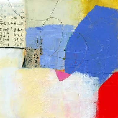
This piece is 10"x10", and it's one of my favorites.  It came at the end of a long day and a long process, at the point where I was covering over big swaths of intricate collage and paint. 

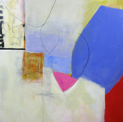
This is a snapshot of the 3'x3' copy, not a good photo or scan, but that is only one reason it looks washed out and flat.
 Some of the differences are obvious:  texture is missing from the larger painting. The values are not right, and so far I haven't been able to come up with a substitute for the calligraphy.  I notice that depth is much more difficult (for me, at this point) to achieve in a larger piece.  Hmmm.... even if I got the scale of all the shapes correct (which I didn't), I have to figure out how to get more push-pull.

I will keep working on it as an exercise.  The goal is not to reproduce the original piece, but to see what will happen, see what I can learn, from trying. Any tips on working at a larger scale are most welcome!  I'd also be interested to hear of your own challenges with this.  Thanks for visiting.

Tuesday, December 15, 2015

A Few More Pieces

Here are just a few more of these wonky shape pieces.  Not sure where they are going, but they're kind of fun to play with.


These are all 10"x10" on paper, to be mounted on panel.  They are available in my gallery.

Friday, December 11, 2015

Playing with Color

I was playing with some colors that are new to me, and discovered some really great hues.  Almost every time I order paint I order a color I am unfamiliar with.  Sometimes it sits unopened in the studio for months, and sometimes I can't wait to try it.  Eventually, I get around to exploring the new colors, and always discover something surprising.


This is the first study I did in the video, using Sennelier's Sepia, Blick Matte Acrylic White, and Golden's Indian Yellow Hue fluid acrylic.
In this one I am primarily investigating Golden's Terre Verte Hue, mixing it with their Nickel Azo Yellow and some white.

This is an earlier version of the Sepia test.  I mixed it with a teeny bit of Quinacridone Gold (from Golden) in those few bits on the right.  Otherwise it's just Sepia with varying amounts of white and gray.
Here are a couple of quick tests I did with some unusual colors (for me) from Golden:  Permanent Maroon, which is relatively transparent, kind of an muted red-purple; and Violet Oxide, which looks to me like an opaque version of the same thing.  I mixed them with white, and then with one other color, as indicated. 

Thursday, December 10, 2015

Some New Work

I'm having a lot of fun in my Monoprint Collage class, which is currently happening online.  Here are a few new pieces.  These are made by first printing the shapes through a stencil, then painting in the ground and other elements.  I'm trying to throw unlike things together to see what kinds of conversations they have.

These are all 10"x10", and I will mount them to wood panel.  Along with some other new work, they are now available at Jane Davies Art Gallery, in "Works on Panel".  They will also be available as prints on Fine Art America.  Stay tuned...


The ground color on the right is made from Sennelier's "Sepia".  More on color mixing in a later post.


I posted this one previously.  I think I like it the best - beginner's luck!

Saturday, December 5, 2015

Art on Clothing

At the Chicago Merchandise Mart

From this original artwork
These are the pieces that will be available.

And this original art was applied to...


This line of clothing.
Don't worry, I will certainly blog and brag about it when the clothing is available.  I'm finding out where and when. No, I am not selling it. I just licensed the artwork to the manufacturer.  Fun!

Friday, December 4, 2015

Golden Artist Colors Conference

Just heading back from the "Golden Gathering" in Florida, where I got a fresh dose of information on Golden products, but so much more!  Re-connecting with colleagues, meeting artists from all over the world, taking workshops and attending super informative talks and demos. Here are a few pix.  I'll put together more posts when I get home, with more links and video. 

Here is me (orange T-shirt, gray hair) in Adria Arch's class on teaching intuitive painting.  She is right up my alley, and gave me some FABULOUS ideas for improving my teaching.  We did some really fun exercises that got us painting immediately, totally engaged in the process, without thinking and agonizing.  She got us to tap into that direct line between intuition and process.  I will be trying these in upcoming workshops.

Here are a few things that came out of one of Adria's exercises.
The venue wasn't too shabby, though it was not this sunny. 

I took a watercolor workshop with Bianka Guna, in which we used Golden's new Qor watercolors.  Yes, that is Q  O  R, Qor, pronounced "core".  So I'll be experimenting with them in my studio and share with you.  The colors are intense and rich, and they work beautifully on many different grounds and substrates.


Here is Bianka.  She is an engaging teacher, very entertaining as well as knowledgeable.
This is one of the collograph plates I made in Shari Pratt's workshop.  I have some better pix, which I'll share in a later post.  We used all kinds of textural materials and many of Golden's texture gels to make printing plates. 

Then we printed using OPEN acrlyics, which have a long long long l o n g drying time. They are great for monoprinting because you can take your time working the paint into/on the plate.

Melanie Matthews
One more person I want to introduce you to (if you don't already know her) is Melanie Matthews.  I attended her slide talk on using Pinterest, and found her to be one of the most generous artists I've met, in terms of sharing information.  Funny, fun, a GREAT presenter.  I would take a workshop with her any day.  Check out her Pinterest Boards and follow her.  OMG, what a wealth of carefully curated images she shares.

Friday, November 27, 2015

Looking at Work in Grayscale

Lee Kaloidis, whom I've referenced a few times in this blog, has created a Flickr album of his Whale Songs series, showing it in grayscale as well as in color.  He says:
I'm posting the Whale Songs in gray scale so that I have a record of them. But also because studying paintings in gray scale is fundamental to the way I work and why I do so much work in black and white, and anyone who's interested in my work should know that. Throughout every painting session I'm studying gray scale photos of the piece as it develops. I know if a piece is articulate, balanced, well-constructed, legible, and engaging in gray scale it is fundamentally sound. Color is a strange thing and is a little like money in that it distorts clarity of vision and judgment, and so it is good, IMO, to be able to remove it from the equation in order to assess things at a distance that is free from the distortions of the sensational.
I would not say that a painting can't be successful if color if it is not successful in black and white, but it does seem like a good tool for looking at your work in progress.  Seeing your work minus the strong language of color allows you to see things you won't see otherwise.  This is similar to seeing your work from a distance, through a camera lens, or on a computer screen.  It gives you a different view, which can be revealing. 

I just did a few grayscale versions of some 8"x8" print/collages to see how they looked:


Thursday, November 26, 2015

Happy Thanksgiving and Holiday Weekend

Happy Thanksgiving to those of you in the United States. This is not a real blog post; I'm just showing off a new piece that takes Monoprint Collage in a little bit of a new direction for me.

10"x10", Monoprint on Paper
Actually, there is no collage in this piece, just monoprint with a gelli plate, and paint.  I have a few spaces available in my Monoprint Collage workshop on Whidbey Island in May.  Have a lovely holiday weekend!

Friday, November 20, 2015

Donate to Heifer International


Heifer International's mission is to work with communities to end world hunger and poverty and to care for the Earth.  They do this by providing livestock animals; empowering women; providing basic needs such as clean water, shelter, cook stoves, etc.; supporting sustainable farming efforts, all in their unique Heifer way...  See how it works here.

I am offering a downloadable set of twelve greeting cards, with images of my work on them, for a $15 donation to Heifer.  ALL proceeds from the sale of this card kit go to Heifer.  You will download a zip file with the twelve images and an envelope template, sized to be printed on 8.5"x11" paper.  Last year we were able to donate about $1,000 for livestock and other resources to Heifer International.

Twelve images on greeting cards, downloadable, for a $15 donation to Heifer: