Showing posts with label crayon. Show all posts

Saturday, December 2, 2017

Making Marks

I usually need a break after my busy teaching season, which ended this year with a workshop in Pensacola, FL the first week of November. Then there is Thanksgiving, for which I take time out to see family and cook.  Getting back into the studio for any kind of regular painting practice always takes some time and effort. It's a shift from teaching-traveling mode to more inward-looking, solitary, exploratory mode. The key is to align my expectations with the reality that this is a transition. As enthusiastic as I am to get into my studio after a long season of teaching, it's never easy.

I've been laying pretty low this week with a bad cold, and just poking my head into the studio to push paint around for an hour or two each day.  Works In Progress are great for this: I can just do one or two things to a few pieces with no pressure to finish them, but just to move them along somewhere.

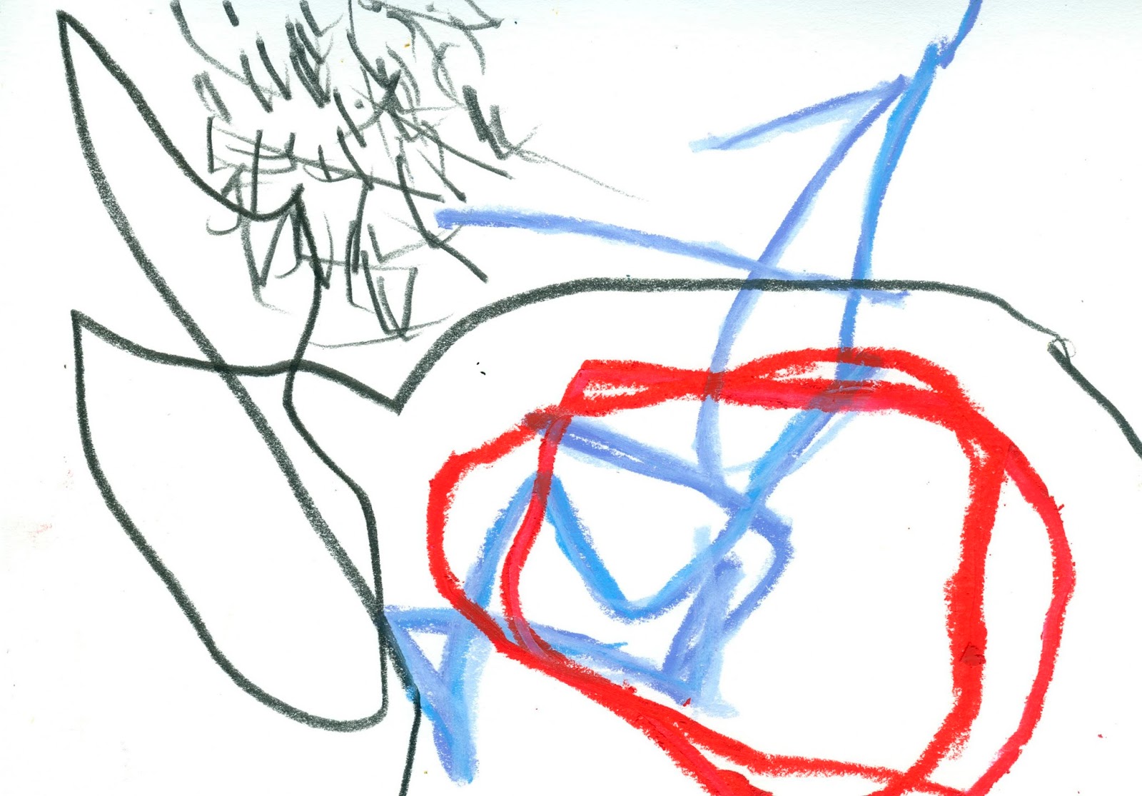
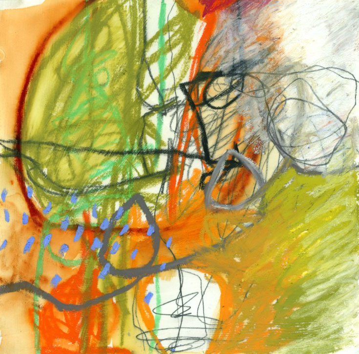
Yesterday I did a little Mark-Making exercise: on a stack of cut-offs from my paper cutter, which are all about 5"x8", I used limited tools to make lines and patterns, paying attention to creating variety and leaving some breathing room.  Here are some of the results:


You can see from these that there is some overlap in the kinds of marks I made. For example the arch or half-circle shape appears in four of them, with variations in a couple of the others. The awkward scribble makes an appearance in a few of them. There is a pattern of irregular dots and dashes in some of them... And yet each one is unique. Each one has something - a color or a mark - that it does not share with others.

I think this kind of working-in-a-group, WITHOUT trying to make anything specific, often reveals some of our default marks, suggests new combinations, and generally greases the wheels for visual exploration. To me it is important that these "studies" have no pressure on them to BE anything other than the result of a process. If they went directly into the wood stove now, it would be fine; their purpose has been served. I've made them, and I've looked at them.

Monday, August 15, 2016

Crayons!

Lorraine Bell's new book, The Art of the Crayon, has just been released, an my art is on the cover!  I'm so excited about this.  I don't have my copy yet (should be here any day), but I am quite looking forward to seeing what other artists do with crayons.  You can check out Lorraine's blog post about it, and see who else contributed to the book.  Looks like I am in good company.

You can see previous posts I have done, including video, on using crayons and oil pastels here and here.  I am teaching a one-day workshop at Art and Soul called Beyond Crayons: Mark-Making at its Finest" in April, 2017.  It is full, but you can get on the wait list, or just show up and beg Glenny, the Queen, for a spot in the class, if you like.  Or just take out your crayons, get Lorraine's book, and GO!

My favorite crayons are Caran d'Ache Neocolor II.  They are pigment-rich, and are a little more friendly with acrylic paints than oil pastels are.  If working in oil media, no acrylic, I love using Sennelier oil pastels for their buttery quality, and Holbein's for a stiffer consistency but with the same pigment density.  The Caran d'Ache Neopastels are great too.  I think the Cray Pas and other very inexpensive oil pastels are like the Crayola of the oil pastel world.  The professional quality oil pastels and crayons are well worth the money.  Just my opinion.

I am, as of recently, exploring R&F Paints' Pigment Sticks, which are like oil paint in stick form.  I want to make crayon-like marks, but on a larger scale, and investigating ways to do that.  These pigment sticks are GORGEOUS!!!  Unlike oil pastels, pigment sticks DO dry, over time, so they can be used like oil paint, and combined with oil paint mediums like cold wax and "Galkyd" or other alkyd resins.

Hope you enjoy a visit to Lorraine's blog, and to the web sites of the other contributors to her new book.  Thanks for the visit here!

Wednesday, July 1, 2015

Working Larger

I am having a lot of fun with these crayon pieces, and they work (for me) at this small scale, 10"x10".  I would LOVE, though, to see them really BIG:


Obviously, the crayons I'm using would not scale up like this.  So what?  Oil stick?  Paint on a brush?  I know I (and some of you perhaps) often see a piece that I'd like to do at a larger scale.  I'd like to feel myself in a different relationship, physically, to the painting.  Instead of Me the Artist at the table or standing at the wall/easel, separate from the Painting, I'd love to almost walk into the painting, feel it more like an environment, and then have to walk ten feet back to actually see it.  Two very different relationships to it in space. 

When working on small pieces, I can be the artist and the viewer at the same time, and I think those are very different roles.  As the artist, I need to be in the process, obsessed with the marks I'm making as they relate to one another and to the painting.  As a viewer, I see the final visual content, separate from process.  The piece becomes its own entity, no matter what my process or intentions. Part of the process of making art is going back and forth between these roles.  I wonder how scale would affect my ability to do so, or my perception of this back and forth dance.

Monday, June 29, 2015

Crayons, Again

So I'm still on this crayon kick, and wanted to try various crayons on a pastel ground.  Pastel Ground is a product that Golden makes, which transforms your paper into a toothy pastel paper.

This was my "beginner's luck" piece.  10"x10" on gessoed paper


This is the piece I did in the demo.  I used the materials mentioned in the video, plus various brands of oil pastel.

In this one I'm trying to copy the first piece, at top.
Here is a link to the Cretacolor Monolith pencils.  I think everything else is in my previous post.

Tuesday, June 23, 2015

Crayons and Oil Pastels

Today I worked with lines and scribbles, inspired by a few of my students who were in the 100 Drawings class.  My goal was just to see what I can do with crayons, oil pastels, and other line-making tools, on their own, without point.  I did venture into paint, though, as you'll see in the video, but the focus is on drawing media.  These are not meant to be "pieces", or even studies.  They are just byproducts of my playing around.  Which is how I like to think of all my work.

Crayola, various oil pastels, water soluble crayon

Crayola, various oil pastels, water soluble crayon

This one started on a piece of "scrap" paper, one I'd used to lift paint.  So it has a ground of acrylic paint.  I scratched through the oil pastel with a razor into the dark green at bottom right.

This one is soft pastel (the really dusty kind), conte crayon (the black), a few oil pastels, and Crayola crayons.  Maybe some graphite in there too.

Graphite of various sorts, oil pastels, water soluble crayon

Graphie, ink, Crayola crayon, and water soluble crayon

Soft pastel, graphite crayon, Crayola crayon, ink, water soluble crayon

Various oil pastels and crayons, acrylic paint

Various crayons and oil pastels, graphite, ink, and acrylic paint

This one started on a piece of "scrap" paper on which I had off-loaded excess paint.  On top of the paint is graphite, oil pastel, and various crayons.

Also done on top of paint off-loads: mostly oil pastel, acrylic paint.
The crayons and oil pastels I reference in the video are:
  • Crayola Crayons, which you can get anywhere, so a link is unnecessary.
  • Cheap Oil Pastels: I used ProArt, but Cray Pas are comparable; Van Gogh are good inexpensive oil pastels.
  • Sennelier Oil Pastels:  these are buttery and pigment-rich.
  • Holbein Oil Pastels:  I love these; they are a bit harder than the Sennelier, and just as smooth and pigment-rich.  They come in a H U G E range of colors, with tints and shades of many colors as well.  These are a bit larger than Sennelier, and comparably more expensive per piece.
  • Caran d'Ache Neopastel: yummy, not as soft as Sennelier, good pigment load.  These are a little smaller than the Sennelier, and very slightly cheaper.  Probably the same price per unit of weight or volume.
  • Caran d'Ache Neocolor II:  these are the water soluble crayons I use all the time. 
In some of the above pieces I've used graphite crayon, graphite pencils, and pitt pens as well. Fun FUN!! 

Wednesday, December 24, 2014

Black and White

I've been in awe of Mayako Nakamuro's black and white work for a couple of years now since discovering her on Flickr.  The rawness and energy of the mark making is breath taking.  See her work on Pinterest as well.

Using her as inspiration, I began a series of 12"x12" black and white pieces, using India ink, graphite, acrylic, and crayon:

1. I'm considering this and the two below provisionally finished.

2

3

A dozen or so pieces in various stages of the process
#2 above, in process

Another in process: a layer of marks, then a layer of paint

This is the first layer: India ink washes, graphite, pencil, and white Caran d'Ache crayon

Same materials as above, the first layer

This is the piece above, with a layer of paint.
I'm finding working in black and white very freeing.  It allows me to pay more attention to the quality of marks and the range of value.  When stuck in a rut, it can be extremely helpful to look at the work of another artist and use it as a springboard.  Some shy away from "copying" another artist, but I feel that even if you begin by copying, if you do enough pieces you inevitably make them your own.  For this group I really did have a couple of Nakamura's pieces up on my computer screen, and referred to them when I felt I was repeating my same old familiar marks.  But for the most part I feel I found a way to move forward with my own work.  THANK YOU Mayako Nakamura for the inspiration!!

Hope you all have a fabulous holiday!

Yesterday was my birthday, and I want to thank all of you who posted birthday on my FaceBook page.  It was, indeed, a very happy birthday!

Friday, March 18, 2011

Letting Go of Looking Good: Blind Self-Portrait

If you’ve ever taken a drawing class, you are probably familiar with the idea of drawing what you see with your eyes, not what your mind thinks you should see. In other words, really look at what you are drawing and respond to that, rather than some mental notion of what the object is. We could all draw a coffee mug, for example, from an image in our mind. It is a different thing to really look at a particular coffee mug and trace its outlines. Drawing from imagination or memory and drawing from seeing are two different things, and practicing the latter will enhance your skills at the former.

In order to draw from seeing, we have to let go of any desire we you might have for the drawing to look like something. Paradoxically, that desire – that attachment to our idea of what something should look like – only gets in the way of seeing. Here is an exercise that will help you Let Go of Looking Good:

You will need:
Paper that will accept watercolor, several sheets
A white crayon
Watercolor paint, any color
Paint brush
Mirror
Cheap drawing paper or a sketchbook
Pen of your choice

1. First establish that this exercise is for your eyes only, unless you decide to share it.

2. Remember to approach the exercise with a sense of inquiry, not with a particular goal. It does not matter what the result looks like; what matters is that you approach it honestly and wholeheartedly.

3. Set up your mirror so you can see your face.

4. Slowly and carefully, draw your face with white crayon on the watercolor paper without looking at the paper. Look at your face in the mirror only. Take your time.

5. Brush water over the drawing, then paint over it in watercolor to reveal the drawing. Put it aside to dry, and repeat the process.


6. After a few blind self-portrait drawings, try a few with pen on the drawing paper or in your sketchbook, both blind and looking at your paper. Even when you are not doing a blind drawing, look more at the subject (your face in the mirror) than at the paper.

Making self portraits, for me, is one of the most effective ways of practicing letting go of looking good. This letting go not only helps you to see better, but it cultivates acceptance. Sometimes it is hard to accept how age affects how we look. We’re tempted to leave out that wrinkle or make our eyes look bigger and more youthful. Resisting this temptation not only encourages acceptance, but will result in much more beautiful and interesting drawings.

Tuesday, March 15, 2011

More Blind Scribble

Thanks for all your comments of my blind scribble drawing practice that I posted on Friday. I thought I'd share a few painting-collage-drawings that I did based on this practice. I began each in this series with a newspaper collage background, just to add some text and texture.

In this one, I followed the newspaper collage with a blind scribble in black oil pastel, then another one in a terracotta oil pastel. I painted with acrylics, being guided by the structure imposed by the collage and the scribbles. I stamped the Q's, and then went over the scribbles to give them more visual weight.


In this one I painted acrylics over the newspaper collage, and then did the blind scribble with a water-soluble graphite pencil. Next came the white crayon scribble, not blind, and watercolor in sepia and pthalo blue. I emphasized the pencil scribble with black oil pastel, then added the red in acrylic. I love that red!


Here is a page in my sketchbook in which I did two half-blind drawings of crows in water-soluble graphite pencil. By "half-blind" I mean I was looking at a picture of a crow, not at my paper, and then towards the end of the drawing I did look at my paper so that I could make a closed shape. Sort of like cheating just at the end. But this process does result in really interesting shapes!


To use these crows in a collage-painting, I first traced them both onto white Art Tissue paper (not wrapping tissue, which has a shiny side) in fine point Micron pen. Then I cut them out, roughly, and applied them to this collage-painting, PEN SIDE DOWN, using acrylic matte medium. This is an adaptation of a technique I learned from Jane LaFazio. The tissue paper practically disappears so that you are left with the drawing layered onto the collage.


Trying to incorporate drawing into my collage-paintings is an ongoing process, and doing these series of studies in my sketchbook or on small sheets of paper is immensely helpful. Thanks for visiting!

PS: I decided to change my picture in my Profile. This one is more realistic, and more recent.

Friday, March 11, 2011

Friday Drawing Series

Drawing Practice


Welcome to
the first installment of a series on DRAWING PRACTICES, which I will be posting every Friday for six Fridays. It’s not a step-by-step how-to-draw course, as much as a series of suggestions for keeping your drawing practice alive.

Blind Scribble


The Blind Scribble is a good place to begin if you are either new to drawing or haven’t done it for a while. Maybe you paint, collage, sew or make assemblage with abandon, but drawing, for some reason, intimidates you. Even if you draw on a regular basis, this first practice brings you back to basics.

You need:
Paper
A pen
Other drawing materials (optional)

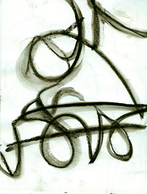
Put the piece of paper in front of you on your work surface. Place the pen somewhere on the paper. Close your eyes. Draw. Just move the pen around, slowly exploring the paper. Focus on the sensation of moving the pen over the paper. Now try different kinds of lines, still with your eyes closed: try wavy lines, saw tooth lines, broken lines, smooth lines, jagged lines…. Move faster, move more slowly. When you’ve had enough, stop and open your eyes. Get another sheet of paper and repeat the process.
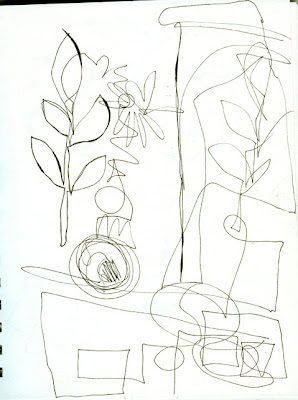
Ways to vary this exercise:

Draw to music: draw to slow, melodic music; draw to fast rhythmic music; draw to music you hate; draw to atmospheric, non-rhythmic music. Keep your eyes closed and give your whole being over to the sound and the feeling of drawing.
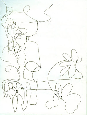

Switch drawing materials: Change to a brush-tip marker, a crayon, a colored pencil, a thick graphite stick, a piece of charcoal… This one is charcoal, then I brushed water over the drawing.

Make one blind scribble drawing; switch material and make another drawing over the first one.
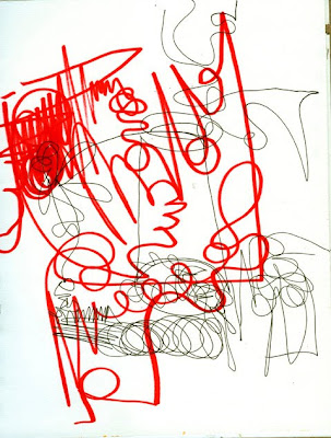
I used water-soluble pencil for the second blind drawing over the marker original. Then I brushed water over the pencil.
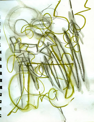

Make a blind scribble drawing, then, with your eyes open, draw into it or over it with a different material.
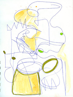
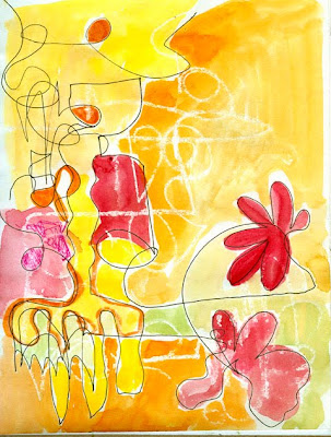
In this one I did a blind scribble in white crayon over the first blind scribble, then painted into it with watercolor.
For more drawing exercises, see the Tutorials page on the Sketchbook Challenge blog. I hope you enjoy these exercises; thanks for visiting!