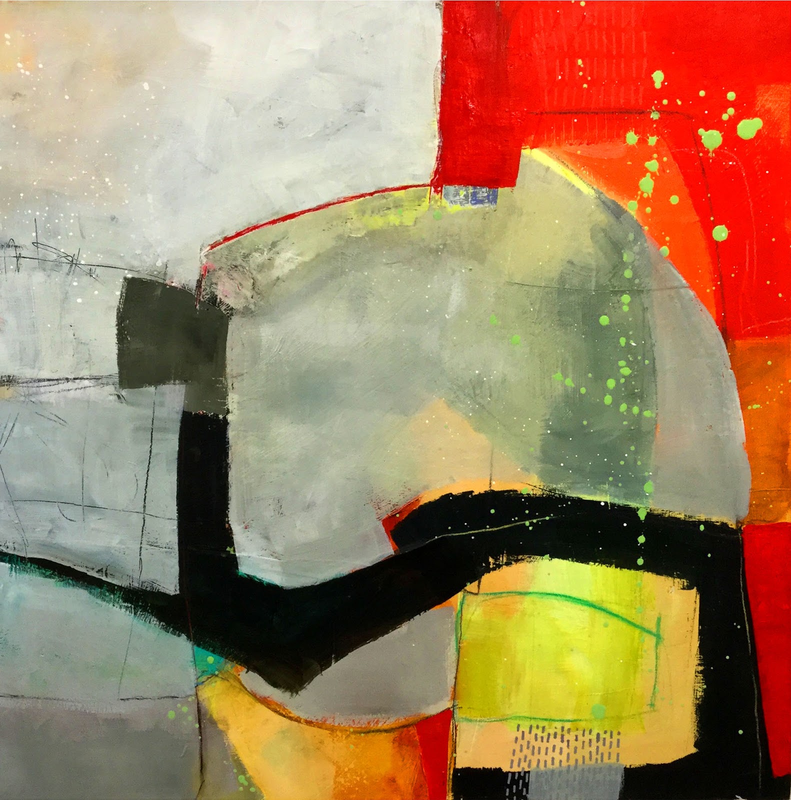
The last few days I've been trying to get back into a groove of painting. With studio construction back underway and various other projects I'm working on, painting has taken a lower position on my priority list. Building momentum always takes time, and can be frustrating. I flailed around for a while, and then decided to go back to something that feels reasonably comfortable.
As a workshop assignment I often do my Complementary Colors exercise. Here are a couple of examples, which are 10"x10":
Achieving as much
variety as I can within one color is a great exercise, and it helps me focus. So I decided to play with orange on top of "works in progress" (which means works that have been hanging around, unfinished, for a while and need an injection of drama). The following pieces are 20"x20" on panel:
The colors I've used here are:
- Vat Orange
- Pyrrole Orange
- Transparent Pyrrole Orange
- Cadumium Orange
- Dairilyde Yellow
- Azo Yellow
- Hansa Yellow
- WHITE
Plus Caran d'Ache NeoColorII crayons.