Come join me in Pheonix on August 8 and 9 at ART UNRAVELED!!!! I will be teaching Scribble Collage on August 8, in which we spend the day painting papers using a ZILLION techniques, and then make collages with these yummy materials. On August 9, I will teach New Dimensions in Collage. We make our collages 3-dimensional by creating panels and shadow-boxes with foam core to add depth and layers to our art.
Here is one example of a "Scribble Collage"
I made a collage with my scribble painted papers, and then used the same techniques for painting over them to focus the composition.
A few from a recent "New Dimensions" workshop at Ink About It, which we called "Dream Houses" - same process:
Leslie's piece in progress:
And Pat's:
I hope you can join me in Phoenix for this art extravaganza and total immersion in creativity! To register, go here. Thanks for visiting!
Wednesday, May 25, 2011
Monday, May 23, 2011
Digital Art Tutorials
Cloth Paper Scissors Magazine has just put out a free e-book of four digital art tutorials, one of which is mine! I'm thrilled to pieces to be included in this e-publication, and it is FREE! You can download it HERE. In my tutorial I discuss how to alter images in Photoshop and print them out on fabric to use in fabric/paper collage. Here are a few pieces in progress using these techniques. The finished pieces are in the e-book.
"Forest Dream"
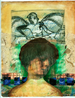
"Pedestal"
I want to show you in a little more detail how I got some of these layered images in Photoshop.
First, I scanned some images of these Greek vase paintings, and made them the same width, 5". (In this post they don't look the same width, but trust me).
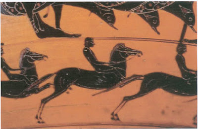
In Image 1, I went to Image > Adjustments > Hue / Saturation and played with the hue slider to change the color:
Then I went to Levels (Image > Adjustments > Levels) and used the left and right sliders to bring up the highlights and darken the darks:
On Image 2, I simply used Levels to brighten the lights and darken the darks:
Now, here comes the fun part. Using the Move tool, I moved Image 1 onto Image 2:
This creates a layer over a background. In the layers panel, I double click on the layer (Image 1) and that opens the Layer Styles box. I play with the Opacity slider to make the image more transparent so you can see Image 2 underneath Image 1.
I then cropped the image using the crop tool:
Then I flattened the image, Layer > Flatten.
To selectively change the color I went to Image > Adjustments > Replace Color, which opens a dialog box like this:
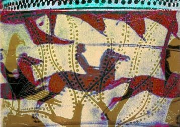
Click on the color in the image that you want to replace (I clicked the gray of the horses), then play with the hue, saturation, and lightness sliders to change that color. The Fuzziness slider determines how broadly you want to define your selected color, and that color will show up as white in box that shows the image. Here is my result:
Then, just for fun, I played with the Hue / Saturation tool again. Image > Adjustments > Hue/Saturation. Here is another altered version of the image:
I know this tutorial requires some basic knowledge of Photoshop, so I hope there are enough of you out there who can take advantage of it. Do get the free e-booklet from Cloth Paper Scissors! There are three other tutorials with fabulous art.
"Forest Dream"
"Pedestal"
I want to show you in a little more detail how I got some of these layered images in Photoshop.
First, I scanned some images of these Greek vase paintings, and made them the same width, 5". (In this post they don't look the same width, but trust me).
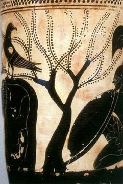
In Image 1, I went to Image > Adjustments > Hue / Saturation and played with the hue slider to change the color:
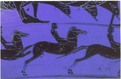
Then I went to Levels (Image > Adjustments > Levels) and used the left and right sliders to bring up the highlights and darken the darks:
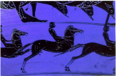
On Image 2, I simply used Levels to brighten the lights and darken the darks:
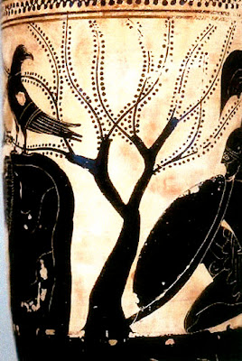
Now, here comes the fun part. Using the Move tool, I moved Image 1 onto Image 2:
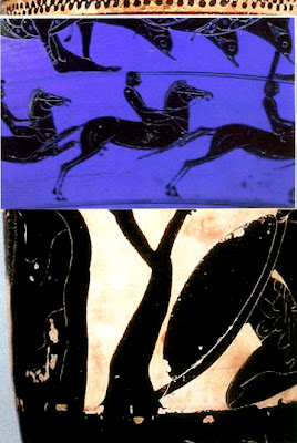
This creates a layer over a background. In the layers panel, I double click on the layer (Image 1) and that opens the Layer Styles box. I play with the Opacity slider to make the image more transparent so you can see Image 2 underneath Image 1.
I then cropped the image using the crop tool:
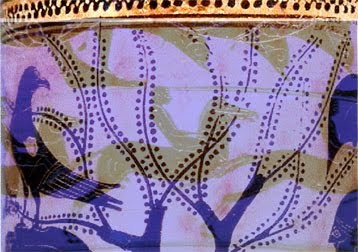
Then I flattened the image, Layer > Flatten.
To selectively change the color I went to Image > Adjustments > Replace Color, which opens a dialog box like this:
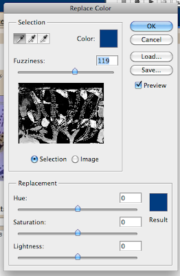
Click on the color in the image that you want to replace (I clicked the gray of the horses), then play with the hue, saturation, and lightness sliders to change that color. The Fuzziness slider determines how broadly you want to define your selected color, and that color will show up as white in box that shows the image. Here is my result:
Then, just for fun, I played with the Hue / Saturation tool again. Image > Adjustments > Hue/Saturation. Here is another altered version of the image:
I know this tutorial requires some basic knowledge of Photoshop, so I hope there are enough of you out there who can take advantage of it. Do get the free e-booklet from Cloth Paper Scissors! There are three other tutorials with fabulous art.
Friday, May 20, 2011
Resistance - Resists
As many of you know, this month's theme on the Sketchbook Challenge is "Can't Resist This". So I thought I would share one of my favorite techniques that makes use of a resist. In this case the resist is gesso, but you could use any kind of acrylic medium.
First I coat the sketchbook page or paper with a thin coat of gesso and let it dry thoroughly. Then I fill the page with acrylic color, in this case some reds, golds and purples. While the paint is still a bit wet I spritz on some water from a squirt bottle, and tip the page to get some drips. Let it dry a bit more (the water is still wet!), then blot with a paper towel. If I don't gesso the paper first, then it absorbs the paint more and you don't get the dramatic effect.
For a second kind of resist, I cut out a shape (in this case, a bird) in freezer paper and ironed it to the painted page. I learned this technique from one of our sketchbook challenge participants, Laura, who posts on our flickr site. Then, I painted around the freezer paper mask before removing it. Just a sketchbook page, not a finished piece.
Laura said she got the idea from a tutorial on the Sew Daily newsletter, in which they were making freezer paper stencils for quilts. Click here to view the article (Thanks, Laura, for the link!).
Here is my own video tutorial on the "Gesso Resist", or "Spritz and Blot" as I prefer to call it. I did include my own version of the freezer paper technique as well.
If the video doesn't work, click here to see it on YouTube.
Here is the piece from the video, stage one:
And after the freezer paper masks were removed and I'd painted over areas of it. Just an experimental piece, but I learned a lot from this experiment!
Thanks for visiting!
Labels:
acrylic paint,
freezer paper,
gesso,
mask,
sketchbook,
sketchbook challenge,
tutorial
Friday, May 13, 2011
Compositional Studies - Cruciform Series
For this Friday Tutorial I'm going to show you my process in exploring a common compositional format, the "cruciform". Which merely means a cross shape. The areas that form the arms of the cross are generally busy, whereas the four quadrants are relatively quiet.
In my upcoming online workshop, "Keys to Dynamic Composition", we begin by looking at the bare bones of what makes a good composition: Unity and Variety. Then we look at the elements and principles of composition and how you can use them to create both unity and variety, through the lens of various compositional formats, including the cruciform, the abstract landscape, repeating shapes, and more.
Working in series is a way to explore an idea and try out different expressions of that idea. It also helps you to get in a groove and loosen up. For this series, the idea is Cruciform. I vary the collage materials, the colors, and the arrangements, but the all tell me something about this compositional format.
One way of approaching collage painting is to start with a painting, then add collage elements. In this series I began with collage, and then tried to unify each collage arrangement using acrylic paint, obscuring much of the collage beneath.
Below are the Before and After versions of each collage.
Labels:
collage,
composition,
cruciform,
online workshop,
painting,
series,
studies
Tuesday, May 10, 2011
SURVEY RESULTS!!!
Thanks again to all of you who participated in my Art Practices Survey! Here are the results. Not every detail, but the general picture. Please e-mail me if you have specific questions about any of the results. I left out a few of the questions in this summary, as I didn't think they'd be that interesting to anyone but me.
The vast majority of you have been practicing art for over five years. And many in that majority have been creative since childhood. I am impressed with the number of you who started in the needle arts or fiber arts, learning sewing or knitting from a mother or grandmother.
Your mediums of choice are: Collage, Artist’s Books or Art Journals, Mixed Media, Fiber Arts, Painting, Drawing, and Other, in that order. This is how it looks in the graph representing the responses. But in your comments it is clear that many of you love fabric and fibers, and maybe that’s been your entry point to mixed media and collage. Loads of you report trying a lot of different mediums. YAY!
You spend an average of eight hours a week on your art, and many of you report wanting to spend more.
Only a small percentage of survey respondents have taken workshops with me. Many report not having had the opportunity, or having just found me on the web. THANK YOU for taking the survey, even though you have not met me or taken any workshops! And thanks to my faithful workshop attendees too!
Most of you take a few workshops a year, and you take more online workshops than in-person ones because of the convenience. Most report preferring in-person to online, though many report preferring both.
The average respondent bought seven or eight art instruction books in the past year. YAY! We need you to keep buying books, even though so much content is available online. Thank you!
Which areas do you need more instruction in? Of course, many of you checked multiple areas, but the results show: techniques, drawing, and composition, as the top three, with Maintaining a Consistent Art Practice, Understanding Art Materials, Painting, Color, and Other, in that order.
What are your goals in making art? The vast majority of you want to find your own artistic voice, and many of you would like to sell your art. Almost all of you do it primarily to enhance your own life. Very few of you report having FOUND your voice.
Your main challenge in making art is Time. For almost everybody, though for a few there were other things: frustration at having too many ideas or techniques available so that it is challenging to focus. A number of you reported feeling like you have trouble being original, that you resort to copying and would like to learn how to develop your own style. Lack of confidence showed up, due to that ever-present Inner Critic. Discipline was on the list in some cases.
Thanks again to all of you who participated in the Art Practices Survey. I will close that one for now, but post a new one soon. Please let me know if there are particular questions you would like me to ask. Any feedback is welcome. Sorry for the lack of eye-candy in this post.
Friday, May 6, 2011
Texture on Deli Paper
I am done with Friday Drawing Practice for a while, but I thought I would continue to offer little tutorials on Fridays. It's fun, and it keeps me in practice.
Here is a technique for adding texture to paper. I use it in my Scribble Collage workshops, but just recently tried it on deli paper ("dry waxed paper"). Sue Bleiweiss does wonders on deli paper, which she demonstrated at our Sketch-In at Ink About It a few weeks ago. She gets hers at BJ's Wholesale Club for a lot cheaper than elsewhere, but they don't sell it online, so I did not include a link.
Here are a couple of samples of the deli paper with texture. The nice thing about this paper is that is is stronger than tissue paper, but it's almost as transparent.
Then I ripped them up and made a collage in my sketchbook:
Thanks for visiting. Have fun!
Labels:
collage,
deli paper,
Ink About It,
Sue Blieweiss,
texture,
video
Tuesday, May 3, 2011
Scribble Collage at AVA
Last Friday I taught Scribble Collage at AVA Gallery and Art Center in Lebanon, NH. WOW! What a great venue! The classrooms are huge, with loads of table space and lots of light. The staff are super helpful. It was a really fun experience, and I hope to teach there more in the fall. The students were great too, all from New Hampshire, Massachusetts, and Vermont. Here are a few photos:
Me tearing paper that I've painted:
The fabulous classroom we used:
Painting paper:
More gorgeous papers:
The worktable:
Helle's work:
And Carrie's:
Kristen's collage in progress:
I wish I had gotten a few pix of our finished collages; my apologies. They were stunning! If you are anywhere in New England, I recommend you take a look at AVA. In addition to classes, they have great shows in their galleries there, and load of inspiring art going on. Thanks for visiting!
Me tearing paper that I've painted:
The fabulous classroom we used:
Painting paper:
More gorgeous papers:
The worktable:
Helle's work:
And Carrie's:
Kristen's collage in progress:
I wish I had gotten a few pix of our finished collages; my apologies. They were stunning! If you are anywhere in New England, I recommend you take a look at AVA. In addition to classes, they have great shows in their galleries there, and load of inspiring art going on. Thanks for visiting!
Labels:
acrylic paint,
AVA gallery,
collage,
scribble collage,
workshop
Subscribe to:
Posts (Atom)