Our winner, of the celadon paint package is Trish from Duluth. Congratulations, Trish! e-mail me with your mailing address, and I'll ship it out. But the rest of you now know how to mix this color, so you should not lack for gorgeous neutral variations on Celadon. If you order it from Blick, please ask them to make it available in 8 oz bottles. AND tell them that the small bottles are hard to squeeze. The more people who tell them these things, the more likely they are to offer what we want. In fact, you can CONTACT BLICK and make these suggestions, without placing an order.
The Blick Matte Acrylics are better than cheap craft paint, but not nearly as heavily pigmented as professional grade paints. However, what I like about them is their consistent opacity. I generally use the white, black, celadon, and a few other neutrals: sage blue, warm gray, Nimbus gray, and some of the pale oranges, turquoises, etc. They are great for good coverage in muted colors.
One of you pointed out that Liquitex makes a similar color called Baltic Green. I've used that as well; it's gorgeous, but a bit darker and over twice the price as Blick Matte Celadon.
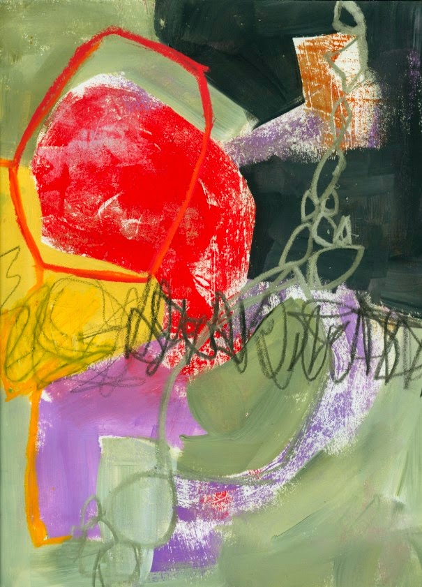
In the above 9"x12" pieces you can see how the celadon makes the red really pop. This is one of the issues we explore in Balancing Opposites: using muted colors to enhance bright colors. We also look at busy areas vs. quite areas; soft edges vs. hard edges, and working with complimentary color pairs. It is a fun way to look at the whole issue of composition.
Thanks for all your comments and participation in this giveaway. Enjoy all your color mixing adventures!
Showing posts with label balancing opposites. Show all posts
Wednesday, February 18, 2015
Thursday, August 7, 2014
Demonstrating a Cruciform Format
In Santa Fe at Valdes Art Workshops one student asked me to demonstrate, start to finish, how I would approach a cruciform format. We were working on creating busy/active areas - areas that catch and move your eye - and contrasting quiet spaces. Here is the piece I did; it is 8"x8".
![]() |
| I began with collage, using lots of contrasting papers. |
![]() |
| I added some pattern, scribbling, more papers, and bright paint, just to give myself a lot to work with. |
![]() |
| Painting Over, adding more, subduing more... |
![]() |
| Here is the piece, provisionally finished. |
In this format, the active areas form a cross shape, each arm reaching to the edge of the page. A cruciform format can be used in anything from a simple cross-on-background, to a figure, still-life, or landscape. As an abstract format it poses interesting challenges, and I use it in my Keys To Dynamic Composition online class.
The contrast, or balance, of busy areas with quiet (but not boring) space is an interesting lens through which to view abstract pieces. We tackle this in my class "Balancing Opposites: The Yin and Yang of Abstract Composition". My next offering of this is at AVA Gallery in Lebanon, New Hampshire. I also address this issue in Big Fat Art, which I am offering at Art and Soul in Virginia Beach on October 3. I have a Pinterest board where I collect examples of art that I find interesting in this respect. Take a look. When you look at art this way, it's interesting to see how relative the terms "busy" and "quiet" are. An area that looks quiet in one context may be the most active area in another.
Often a workshop participant will come to me and say "I know, my piece is too busy. I overworked it." To which my response is often: you haven't worked it enough. Most of my pieces are "too busy" before they even begin to take shape. I tend to throw a lot at a piece, let it get a bit chaotic, and then paint over sections selectively and gradually until a direction emerges.
I'd be interested in your thoughts on this.
Labels:
balancing opposites,
big fat art,
cruciform,
demo,
workshops
Subscribe to:
Posts (Atom)


