Here is a short series of demo pieces I did in Green Valley, AZ, the other week. We were using paint, collage, and mark-making to explore complementary colors. These are all 10"x10".
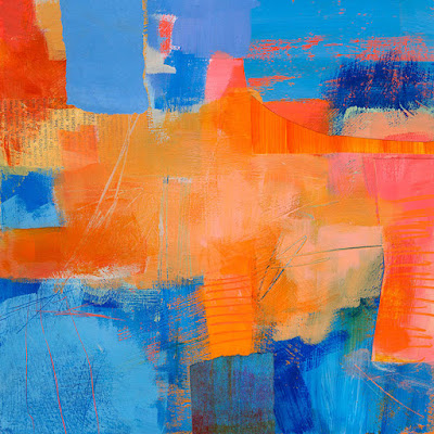 |
| Green Valley Demo #1: In this piece I have almost equal percentages of blue and orange. I find that the most challenging ratio. |
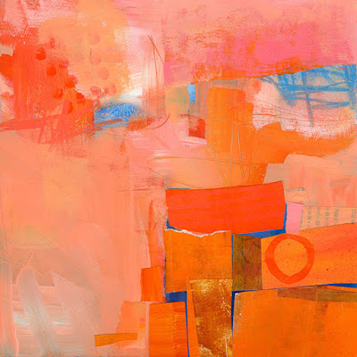 |
| Green Valley Demo #2: Here I was playing around more with a range of value and saturation in the orange. I love the pinks, corals, and salmon colors you can get in this range. |
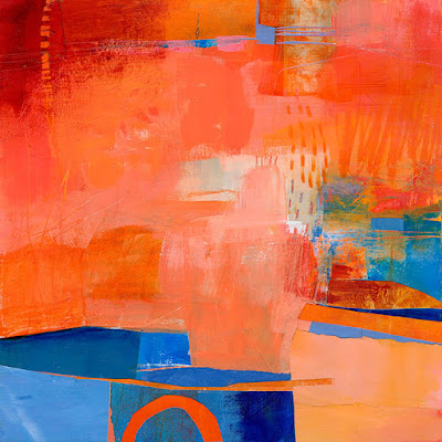 |
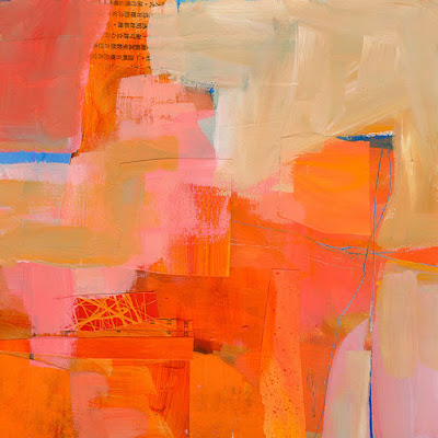
| Green Valley Demo #3: This is probably about 75 - 80% orange. I am tempted to cover over the whole bottom left section with orange.... |
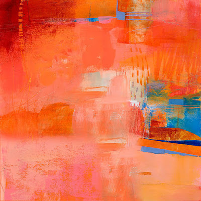 |
| Green Valley Demo #3 Alternate: OK, I just did that in Photoshop to see what it would look like. What do you think? |
 |
| Green Valley Demo #4: Here I let the orange get really washed out. More desert-like. I love the contrast of the very light neutralized orange with the brighter colors in the center, and just teeny bits of blue. |
DO try this at home. Choose one pair of complementary colors: blue and orange, red and green, or purple and yellow. Use as many versions of each color as you like, mixing them to vary the hue slightly (orange, red-orange, yellow-orange, but not red and not yellow), and mixing with white and very light gray to vary the values. Paint, collage, use crayons, scratch into the surface with a razor. The techniques are up to you. The key is to do a SERIES of them exploring various proportions of the two colors. Have fun!


Thank you for the lesson! I do like Green Valley #3 with the photoshopped orange.
ReplyDeleteI prefer the original GV#3, i like the sharp edge of blue contract but probably wouldn't if it was without the magical sections of orange within it? Does that make sense?
ReplyDeleteI will eventually learn to proof read before I push "publish", of course "i" meant "contrast". ;op
ReplyDeleteWhat orange paints did you use?
ReplyDeleteNot many. Mostly Pyrrole, and mixed that with yellows and white.
DeleteThis is a great lesson in keeping it simple.
ReplyDeleteThe direction is simple, the pieces go through many many layers and stages.
DeleteGorgeous, all of them..but my favourites are the first and the third one!! I love them!! Such a good little exercise! Thanks for sharing!
ReplyDeleteHugs Giggles
wouldn't you love doing a video of your process?
ReplyDeleteI think the blue gives weight to the lower edge of the original number 3 and therefore "grounds it". It also creates a 3D illusion (blue being foreground). The alternate version is less defined,vague and gives me a feeling of not being finished.
ReplyDeleteYep, I'm sharing an opinion with Liz. Was sad when all that luscious blue was gone. Yum yum yum! Just did a painting on plexi workshop with careful image creating and some crazy colour splashing would be a great contrast!
ReplyDeleteMy favorite color combination! I love them all, but especially #2 and #4.
ReplyDeleteI agree! #2 and #4 both are most interesting and pull me in.
DeleteHi Jane,I love orange.
ReplyDeleteDid you add collage in different layers? I see it in 1 and 3 but the text looks different. Or did you use alcohol to remove layers?
I cant wait for black and white.
Benita
Hi Jane - very fun post! I recently have done several explorations of orange and have fallen in love with orange. I really like the pieces above that are mostly orange with tiny bits of blue. I know these are beautifully vibrant, but what would you say about mixing blues and oranges to get various interesting neutrals?
ReplyDeleteI've been on an orange kick for a few months (several paintings) and for the first time all that you've said in the past about working in series is making sense to me. (yes, I am very slow) For me its been about following what I am interested / curious about. I looked back at some of your blog posts about working in series and you talk about working with an idea... I think its the same thing. I am finding using my sketchbook very supportive in keeping the thread going.
p.s. my current favorite combination is various shades of orange with small areas of purple - the one I'm using is Blick Matte Acrylic Purple Madder.
I agree with Liz and Shelly that removing all the lower blue in #3 leaves it unbalanced and therefore feeling unfinished. As demonstrated in #4, it would only take leaving a tiny bit of that blue to balance the other two blue areas.
ReplyDeleteThis series is a great demonstration of playing with varying proportions and intensities of complementary colors. Reminds me of your banner at the top of the page, which always gives me a welcome kick of joy when I see it.
All gorgeous, great idea and something I must try too. Of the two you've asked for opinions on.......well, I just can't decide I'm afraid, I love them both!
ReplyDeleteGreat! It's funny, I've been experimenting with orange and blue lately too! Not that blue though, but it must be something to do with the season? ;-)
ReplyDeleteAbout the #3 I much prefer it with the blue bottom left hand corner. I like the way the edges are hard in this part, as opposed to the rest, and that blue kind of lightens up the whole thing.
Why don't you create canvas prints you’ll love!? As the old saying goes, a picture is worth a thousand words. Improve Your Decor Skills and Discover #CanvasPrints at Busiest UK Site ►► parrotprintcanvas com
ReplyDeleteHi Jane -I'm writing from OZ. (Australia). I'm with Liz. I prefer the painting with blue at the bottom to anchor the painting. But I'm wondering about the blue at the side that 'runs off' the picture and takes your eye out if it rather than around?
ReplyDeletewow
ReplyDelete