Tuesday, March 31, 2015

More in My Series of Elements

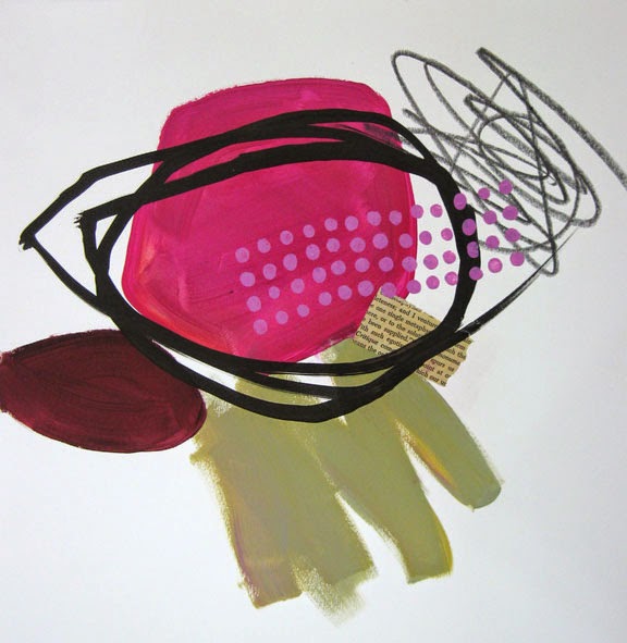
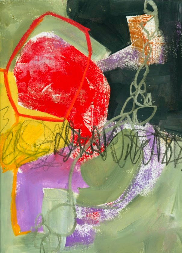
Here are just a few more pieces I did with the idea of a Vocabulary of Elements.  These are all 12"x12":
I was enjoying a more spare approach.


Again, I like the space around this cluster of elements.


This one reminds me of Fog Rolling In.  So, I guess I will title it "Fog Rolling In".

I am doing a big series of studies like this in black and white on 9"x12" cheap drawing paper, but decided to try it on 12"x12" good paper.  Going this spare, in terms of both space and color, is really new for me, and I'm excited to explore it further.

I did try out this approach - creating a vocabulary of elements - at Big Fat Art Weekend, but I'm waiting for more photos to be sent by students (I get so engrossed in the art and teaching that I forget to take pix).  Here are a couple of photos of some of the work:


More pix and video of Big Fat Art coming soon. 

Sunday, March 22, 2015

Vocabulary of Elements

I thought I would try creating a sort of vocabulary of visual elements, and use almost arbitrary combinations of them as starting points for a series of work.  This was inspired by images I saw on Pinterest by Olivier Umbecker.  I'm not saying that he approaches his pieces this way, just that his work gave me this idea.  It is something I'm going to try out at Big Fat Art Weekend next week, see how it goes over with the group.

Here are the pieces, some tentatively finished, others in process:
painted shapes, paint scribble, graphite scribble, pattern, collage, loose line

painted shapes and scribbles, and paint outline shapes, pattern, graphite scribble, loose line

This one might be done.

I added the green cellular thing at the bottom as an element.  This one is definitely in process, or else I will keep it as a "demo" piece.  I like the new marks.

I used that sort of cellular shape thing again in this one, but in fine pen.

The second one on the video.  Still in process.

The shape in the upper left is done with plastic wrap through a stencil.  Give THAT a try!

Work in Progress

This might be finished.  I like the spare quality, all that space around the elements.

Agony and Confusion

This is the first one I did on the  video.  It's still in progress.
As I look at these all together I see some aspects I'd like to investigate further: maybe leaving more space around the elements, maybe trying to use fewer elements in each piece.  I would also like to see how this approach works on a larger scale.  These are all 12"x12".

If you are inclined to try this, I would love to hear how it goes, and if you find it a productive way to work or get jump started.
You could tack these up to your wall as a reminder.

Wednesday, March 11, 2015

Pictures From 100 Drawings

They are paintings, really; I just like the sound of "100 Drawings on Cheap Paper", the online class that started in January and is wrapping up soon.  It is offered again beginning in September.

The focus of this class is working in quantity, working in series, which helps break through the places that make you get stuck. I'm offering a live four-day workshop on Series as Process at Pacific Northwest Art School on beautiful Whidbey Island, May 31 - June 3.  There are a few spots left in this workshop.

These pieces are all student work from various lessons in the class.  Please don't re-post them, as I offer them here anonymously.


Enjoy the eye candy.  Thanks for visiting!

Friday, February 20, 2015

WARM COLORS for a Cold Winter

Oh dear!  It has been cold cold cold here for weeks, and probably many of us in the Northeast are ready for a change.   So I thought I'd try a little color therapy, making a piece using warm cozy colors.  The other inspiration is that I've always wanted to use this song, "Oh Dear", by Anne Janelle, in one of my videos.  It's on her CD "So Long at the Fair".


Wednesday, February 18, 2015

Celadon Winner!

Our winner, of the celadon paint package is Trish from Duluth.  Congratulations, Trish!  e-mail me with your mailing address, and I'll ship it out.  But the rest of you now know how to mix this color, so you should not lack for gorgeous neutral variations on Celadon.  If you order it from Blick, please ask them to make it available in 8 oz bottles.  AND tell them that the small bottles are hard to squeeze.  The more people who tell them these things, the more likely they are to offer what we want.  In fact, you can CONTACT BLICK and make these suggestions, without placing an order.

The Blick Matte Acrylics are better than cheap craft paint, but not nearly as heavily pigmented as professional grade paints.  However, what I like about them is their consistent opacity.  I generally use the white, black, celadon, and a few other neutrals:  sage blue, warm gray, Nimbus gray, and some of the pale oranges, turquoises, etc.  They are great for good coverage in muted colors.

One of you pointed out that Liquitex makes a similar color called Baltic Green.  I've used that as well; it's gorgeous, but a bit darker and over twice the price as Blick Matte Celadon.


In the above 9"x12" pieces you can see how the celadon makes the red really pop.  This is one of the issues we explore in Balancing Opposites: using muted colors to enhance bright colors.  We also look at busy areas vs. quite areas; soft edges vs. hard edges, and working with complimentary color pairs.  It is a fun way to look at the whole issue of composition.

Thanks for all your comments and participation in this giveaway.  Enjoy all your color mixing adventures!

Saturday, February 14, 2015

Mixing Celedon and a GIVEAWAY

[It has been pointed out to me that I have misspelled CELADON.  Whoops!  Very bad manners.  I won't change it in the post or video; just humor me and my misspelling.  (Thanks, Lucie).]

I get asked about this color pretty frequently.  Celedon.  It's a color from Blick Matte Acrylics, and it is only available in 2 oz bottles.  I typically put four to six bottles of it in each Blick order.  I recommend you do the same, so that they might consider offering it in the 8 oz size.  However, you can mix your own, and get some variation and nuance to your taste:


This is the "piece" I made with the leftovers.
This piece obviously relies heavily on this celedon range of color.  This is an example in my Balancing Opposites composition course: balancing large areas with small elements.
This is the GIVEAWAY!!!
I am offering a giveaway that includes:
  • 8 oz bottle of Black
  • 8 oz bottle of White
  • 2 oz bottle of Celedon
  • 1 oz (I think) of Golden Open Hansa Yellow.  (The Open acrylics take longer to dry, but mixed with other colors they just extend the working time a bit).
To enter the drawing, just comment on this post, and identify yourself.  I will post a winner on Wedneesday, February 18, and it is the winner's responsibility to contact me with a mailing address.  Good luck!  And have fun mixing your own celedon and other beautiful neutrals.

Thursday, February 12, 2015

Studio Notes

Here are a few more of the all-over "atmosphere" piece I've been working on, others of which I posted last week. I really like the all-over subtle, low-contrast pieces, but it's definitely out of my comfort zone.  I allowed myself to wander back into familiar territory with the shapes.

Red on Red, 9"x12"
Burnt Orange and Brown, 9"x12"

Aqua and Rust, 9"x12"

Red Rocks, 9"x12"

Blue Stone, 9"x12"

Another Cliff Face, 9"x12"
 The pieces below are a few of a series I've been working on this winter.  They are 20"x20" on paper.


This is not finished.

This one needs to sit for a while.
Thanks for visiting!