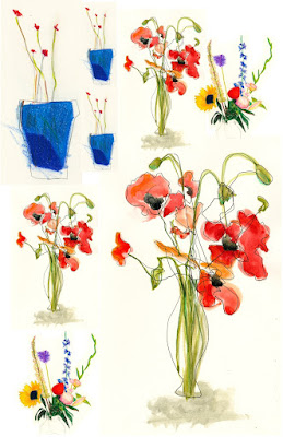
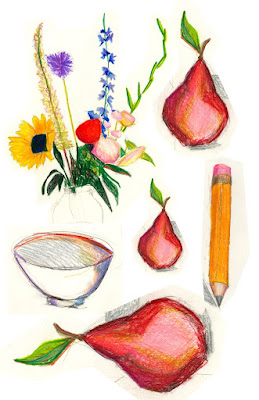
We had a great group last Friday for the Valentine Card Workshop. I'll do it again next February. Here are just a few of the pieces made by participants.
 |
All of these are small, greeting card size. It's a great format for exploring contrasts in color, value, and pattern. How do you make an image lively without making it 'too busy'? Where is the line between visual excitement and visual confusion? How simple can you make an image and still maintain a sense of excitement or mystery?
Hope you all had a good Valentine's Day!


