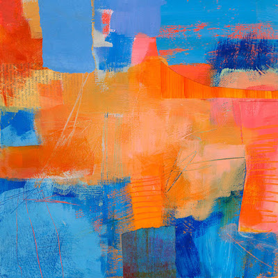
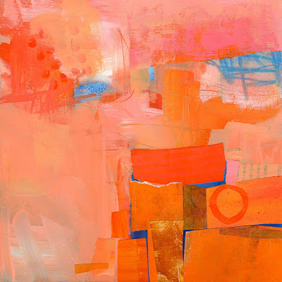
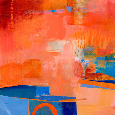
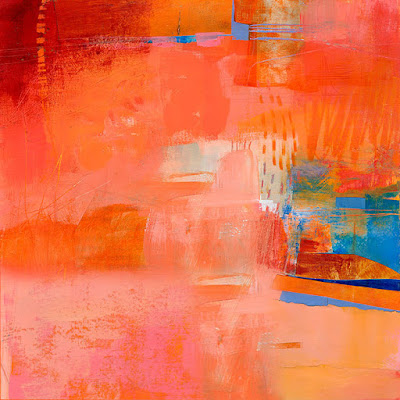
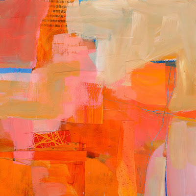
Here is a short series of demo pieces I did in Green Valley, AZ, the other week. We were using paint, collage, and mark-making to explore complementary colors. These are all 10"x10".
 |
| Green Valley Demo #1: In this piece I have almost equal percentages of blue and orange. I find that the most challenging ratio. |
 |
| Green Valley Demo #2: Here I was playing around more with a range of value and saturation in the orange. I love the pinks, corals, and salmon colors you can get in this range. |
 |
| Green Valley Demo #3: This is probably about 75 - 80% orange. I am tempted to cover over the whole bottom left section with orange.... |
 |
| Green Valley Demo #3 Alternate: OK, I just did that in Photoshop to see what it would look like. What do you think? |
 |
| Green Valley Demo #4: Here I let the orange get really washed out. More desert-like. I love the contrast of the very light neutralized orange with the brighter colors in the center, and just teeny bits of blue. |
DO try this at home. Choose one pair of complementary colors: blue and orange, red and green, or purple and yellow. Use as many versions of each color as you like, mixing them to vary the hue slightly (orange, red-orange, yellow-orange, but not red and not yellow), and mixing with white and very light gray to vary the values. Paint, collage, use crayons, scratch into the surface with a razor. The techniques are up to you. The key is to do a SERIES of them exploring various proportions of the two colors. Have fun!
